
An organizational structure is utilized to move the viewer’s attention across any poster, making it easier for viewers to absorb the material. The hierarchy is constructed by combining proper weights, sizes, and colours. We should not underestimate the power of typography in influencing our decisions. A typeface or font has its own personality and connotations.
If your font isn’t a suitable fit for your message or communication, the design will suffer. Certain typefaces elicit specific emotions and determine the tone and mood of the message being conveyed. A poster designer’s job is to choose fonts that complement the design and deliver the information clearly, paying particular attention to details like text hierarchy, kerning, layout, and line spacing.
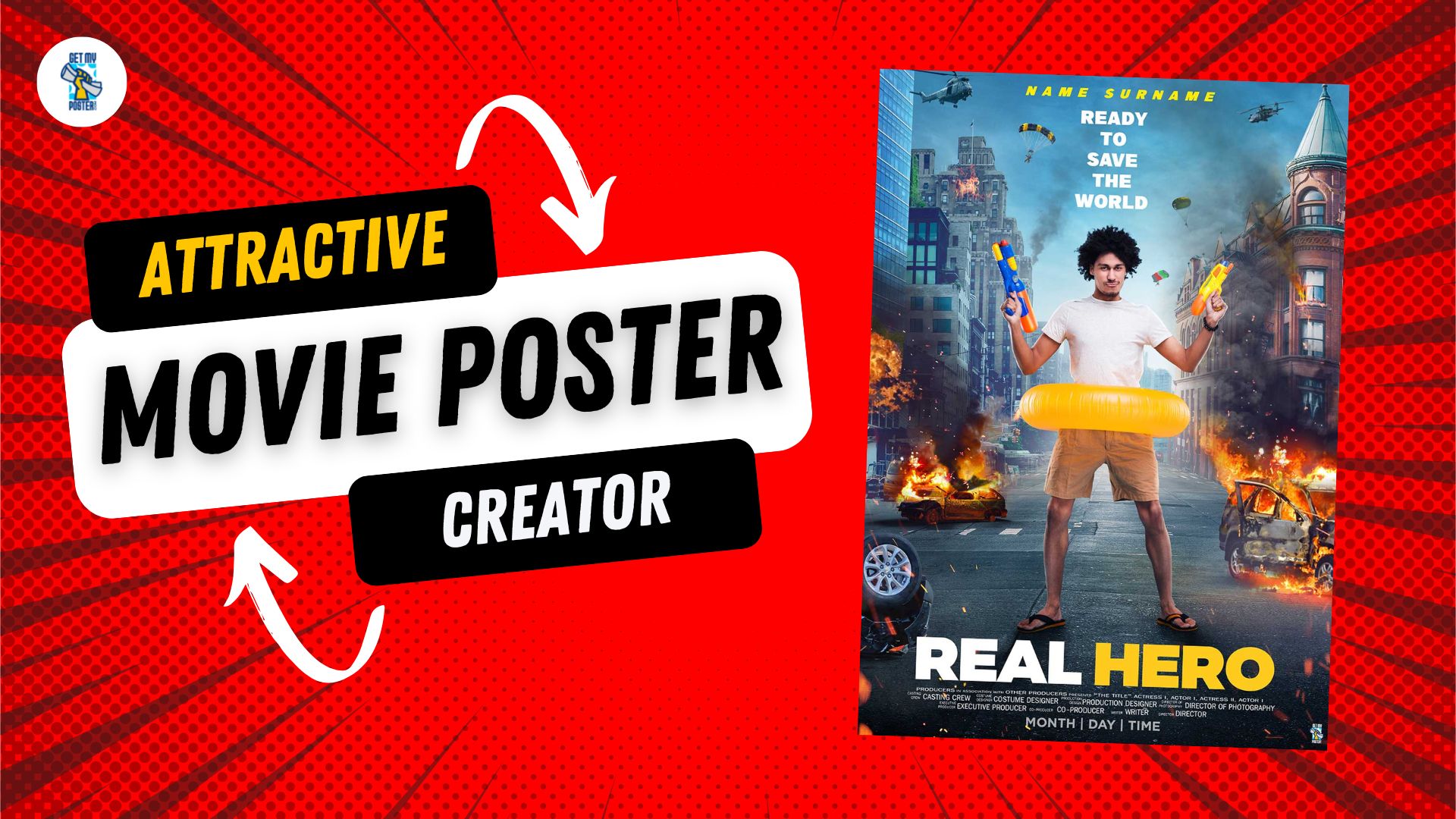
Here is a comprehensive guide
Before you start with the design of the poster from scratch or with the movie poster creator, you must follow these steps:
Begin with your storyline, which should have a introduction, middle, and finish. Organize your thoughts and draw an outline or sketch of where you intend to position the various elements of your poster. Concentrate on visuals and what you need to present the viewer to tell your tale. The poster should not feature an abstract. Poster sizes vary, but a popular poster size is 48″ x 36″ (landscape or portrait). Always size your poster in accordance with the assignment criteria. Titles and headers should be bigger than regular content, but not too so.
Because no two posters are similar, the font size for each poster you make may vary. For your poster font size, a 24-36pt font is a decent place to start.
Best practices for employing typefaces in user interfaces
A smart designer would never use more than three typefaces—and will limit ornamental fonts to a minimum—to keep the interface simple and streamlined.
Contrast
To add impact and break up the page, most designers experiment with different typefaces, colours, styles, and sizes.
The absence of white space
Although it is sometimes disregarded and goes undetected by users, appropriate usage of white space guarantees that the interface is clean and the content is legible. White space may even draw attention to text while also providing an aesthetically pleasant experience.
Alignment
Many UI designers use margins to guarantee that their logo, header, and body of content are all aligned. When harmonizing your user interface, it’s a good idea to keep industry norms in mind. It can create a great magic over your poster.
Conclusion
Typography is a critical design aspect for a graphic designer. There is a lot to think about when choosing the right typeface and typefaces for your design. Make a list of how many typefaces you can see in your home and consider how they are utilized as an experiment. With so many fonts and types to choose from, it’s easy to become overwhelmed. Making the appropriate decision is dependent on much more than simply what looks great. If you’re not sure where to begin, look at what other people are doing. Pay attention to the typography you see around you.