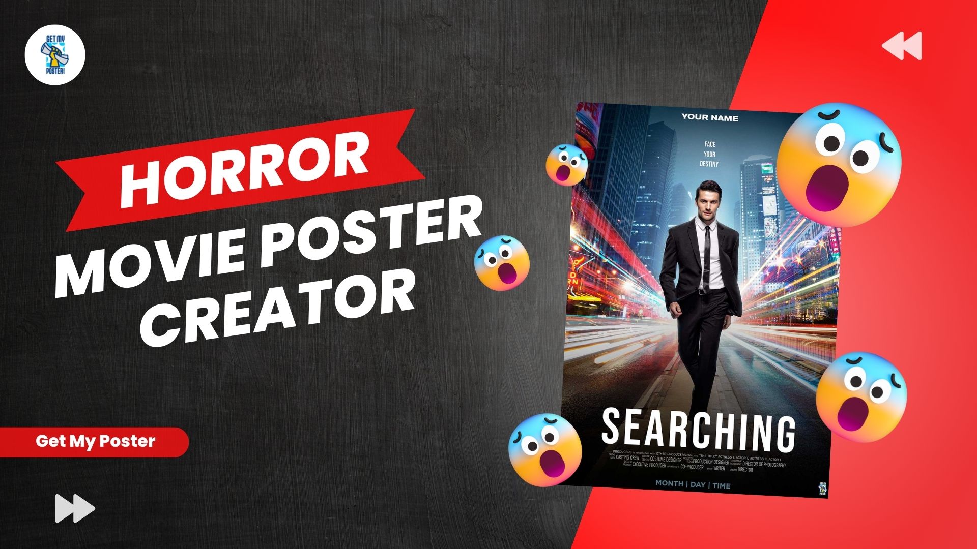
Although it may appear straightforward, producing a movie poster necessitates balancing a plethora of diverse factors. The key to successful film poster design (or any other type of design with a similar objective) is consistency: maintain all of these aspects in sync with one another, and make them all fit around one particular idea or topic.
Capture the essence of things
The film poster is effectively a preview of what the movie is about, therefore it’s crucial to make it as accurate as possible without giving away the entire narrative. The simplest technique to accomplish this is to reproduce the major plot or conflict of the film on the poster.
Capturing the soul of the film in the poster is critical – and this is the fundamental component that will determine all of your design decisions. Allowing the genre to determine design decisions is an apparent, yet critical, method to do this. So, if it’s a comedy, convey the lighter vibe with a photo of the performers smiling or by producing a weird or slightly crazy scenario or collage.
Make the title stand out
In a single glance, your poser should express the title and genre. Most independent film posters I see feature tiny, difficult-to-read titles. Use typefaces and colours that make the headline stand out; instead, make it readable at a glance.
Images that work
What photos will be shown on your poster? How will you explain the plot? There are several approaches to this. One option is to take a moment from the film and make it the centre focus of the poster, as seen by all of the film posters above, or to have the key characters re-enact a scenario in front of the poster’s viewers. Most posters function best when only a few colours are used to create a powerful and eye-catching image. The poster must first attract the sight and then pique the mind’s interest.
Understand your genre
You’d be surprised how often people don’t know the genre of their film, or, more often, they know but are hesitant to commit to what the genre would signify on their poster. How many times it has been heard, ‘it’s not only a horror picture, it’s also an excellent drama…’ and you end up with neither drama nor horror and your film is overlooked? So, better to create a genre-based horror movie poster creator in best way.
Be daring
Choose a single, powerful, clear genre picture that represents the major concept, conflict, or problem – it does not need to depict your characters or settings directly, but should inspire a feeling of what your narrative is about. However, it must be done correctly.
Finally, always add a brief overview of the actors and credits – they are best put on the poster’s border, at the top or bottom. Film posters always follow the same basic standards, therefore it might be difficult to get truly creative with your poster and create a one-of-a-kind masterpiece.

